Detailed logo creation
Miltex, a company specialising in road, square and landscape construction, approached us with a clear vision: they needed a logo, a logo book and a complete identity for their company.
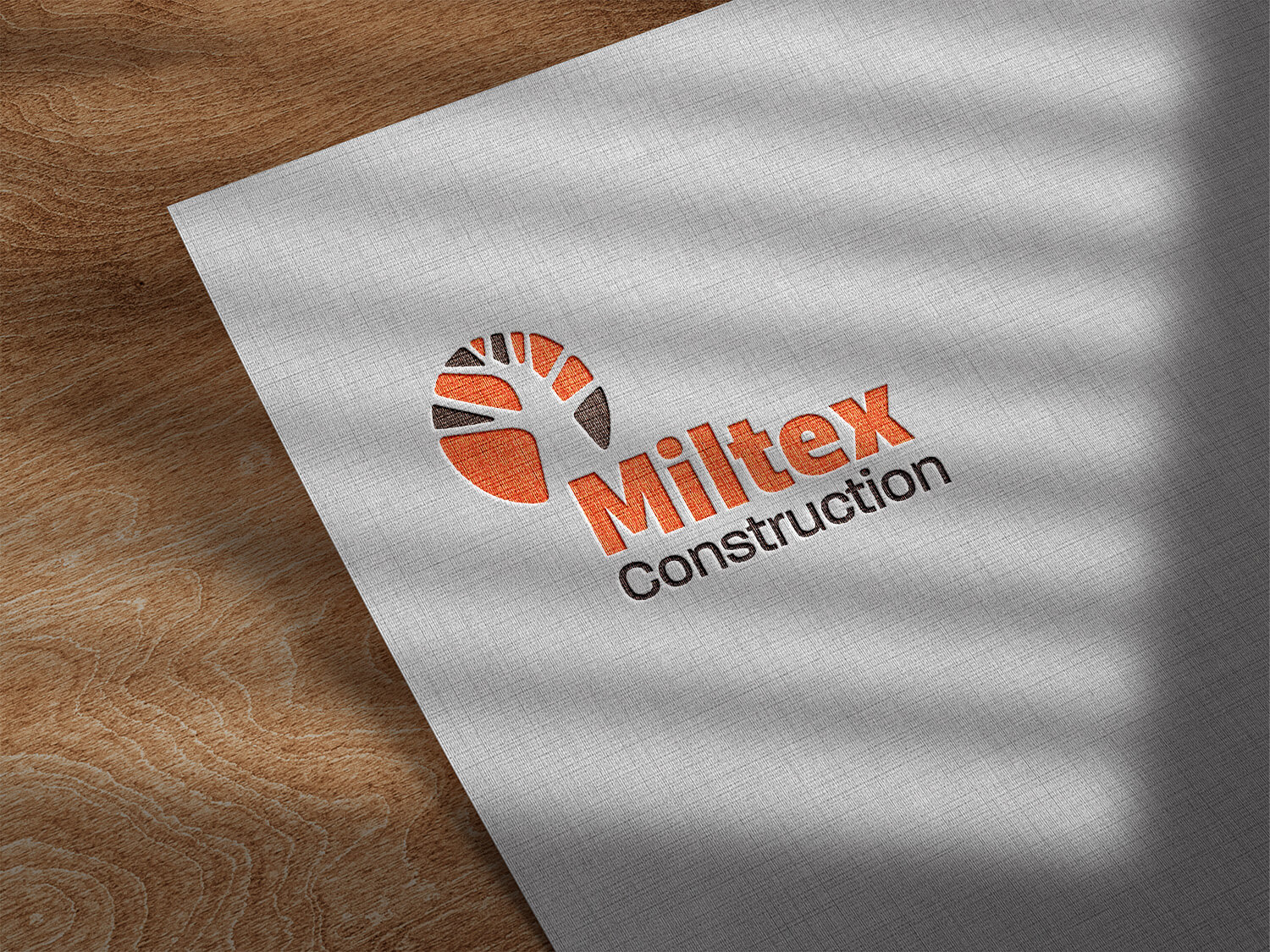
The client had a definite vision for the logo. They wanted a widespread solution: a logo that symbolizes both the tree and the landscape with roads. The chosen color scheme included shades of orange and brown.
Considering the predominantly male-oriented field, the logo and font had to exude masculinity. The colors are inspired by fire and lava, which symbolize strength and energy. The customer was very detailed in their requirements, which is why we diligently finished each tree branch and adjusted the colors and their intensity. We carefully examined the various images of fire and lava to identify the perfect colors and transitions that best represented their vision.
Logos are used on work vests, vehicle stickers, business cards, the company’s website and various social media platforms. In addition, we compiled a logo book that describes the placement of the logo on important printing materials and objects, accompanied by versatile ready-to-print files in various formats. This makes it easy for the customer to use the logo in different contexts and there is no need to worry about whether everything was correct.