


You have beautiful graphics — for example, a delicate apple tree branch, a stylish small font, and carefully chosen details. Everything looks perfect on your monitor. But in print, the result can be quite different: fine lines may appear thicker, very small text can become unreadable, and narrow unprinted areas may simply disappear.
That’s exactly why it’s important to understand how the limitations of printing technology affect fine details – and how to prevent issues before they happen.
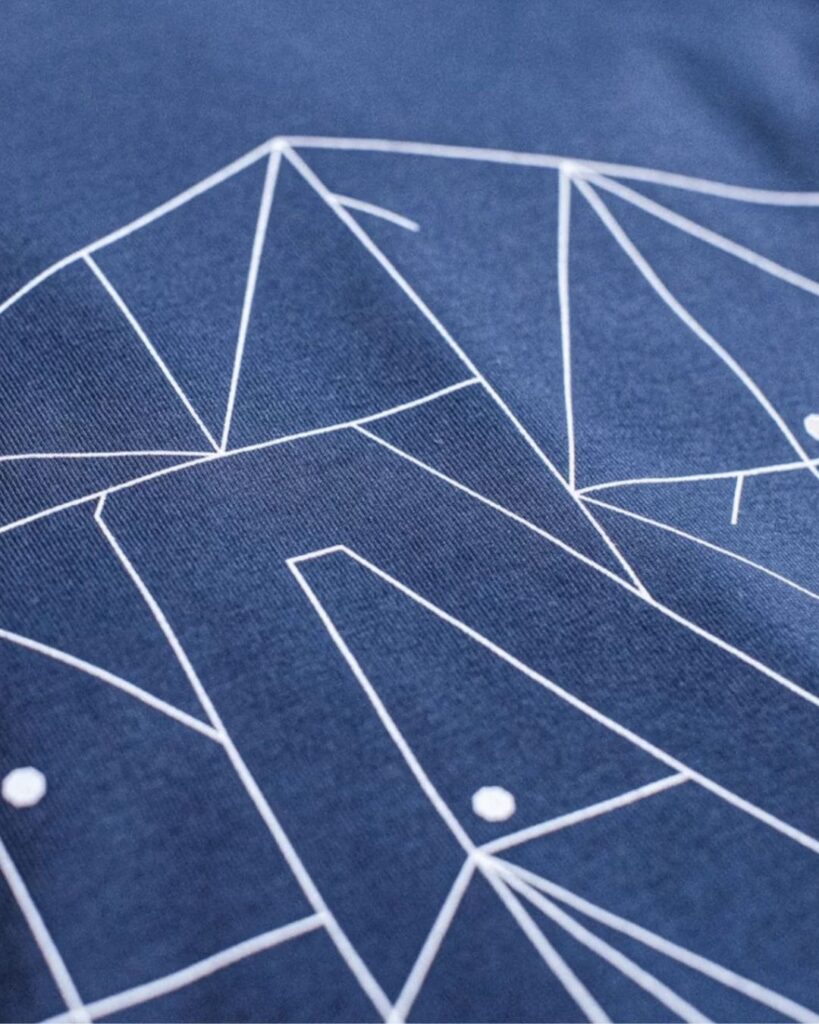
Fine lines in print
In print, ink and material come into play — which means very fine lines will never look exactly the same as they do on screen.
Embroidery adds texture to the line through the thread stitches, which naturally makes the line more robust.
With screen printing, the line won’t stay as fine and sharp as in a digital image – it usually becomes slightly thicker and more textured.
Other printing techniques also operate within their own technical limitations.

Fine unprinted areas in graphics
With fine graphics, it’s not only about line thickness — the spaces between details and lines matter too. If these non-print areas are very narrow, they may start to disappear in print or become uneven.
The thinner the non-printable area is, the greater the risk that ink will partially fill it, reducing the originally intended contrast.

Small fonts and actual print size
The same logic applies to small fonts. Often, text is designed large on screen, and it’s only in print that you realize how small it actually is.
A simple, handy tip:
Place a ruler against your monitor and measure the actual printed size of your design.
Is the text still readable at that size, the same as it will be in print?
This is especially important for small print items — business cards, stickers, labels, and small promotional products.
Proofing and Quality
All our work goes through a proofing and quality control process to ensure that the print is technically correct and makes the most of the chosen printing technique.
With fine lines and detailed graphics, it’s not always a question of quality — sometimes it’s simply a matter of expectations. What looks excellent in print to one client may not meet another’s expectations.
That’s why we always recommend doing a proof print, especially if you’re very particular about details or if the graphics are extremely delicate. This way, you can ensure the final product meets your expectations before full production.
In summary
Beautiful graphics deserve quality printing.
If your design includes fine lines, small fonts, or highly detailed graphics, it’s worth reviewing these areas carefully before printing.
If in doubt, ask for advice or order a proof print.
This way, the final result will be exactly as you expected — and everyone will be happy.

